Component 2: Externally Set Assignment
Title Chosen: Materials
Many contemporary photographers combine a variety of materials with their photographic images.
Photographers to study:
Photographers to study:
- Sally Mankus
- Lee McKenna
- Katherine D Crone
- Alma Haser
Introduction
Here are some photographs and examples of ideas I would like to explore:


I would like to combine these ideas, especially the first and the last. I want to stick to the theme of taking separate photographs (one of a model, one of a material) and layering them together.
Per week, I will have 1 material, and 24 different photographs of a model, I will layer each of the 24 photos with the 1 material.
The outcome should be focusing on how one material makes an abundance of photographs look every week.
I will be mostly exploring the work of Alma Haser and Sally Mankus.
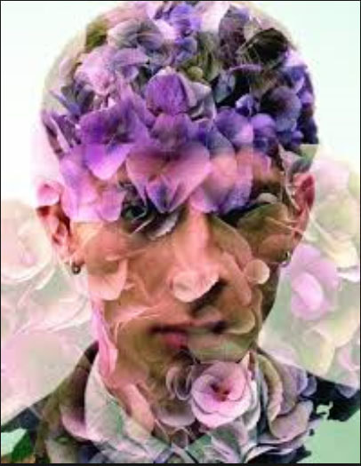
Alma Haser
Here are some examples of Alma Hasser's Work:


I really like how Alma Haser manipulates her photographs. She takes portraiture shots and then layers materials over them. This is similar to what I want to do in that my photographs will have a similar effect, almost like the images have been distorted through the materials used. My photographs will be different in that as apposed to having only the head as the only place in the photograph with a material, my photographs will have materials covering the whole space.
Sally Mankus
Here are some examples of Sally Mankus's work:


I really like how Sally Mankus prints her photographs onto objects. My work will be similar to hers in that the viewer will be able to see the material used through my photograph. The difference between mine and Mankus' work will be for the first few shoots, my photographs will not be directly printed onto objects or materials. A similarity would be that the materials in my shoot will be shown through the portraiture photographs.
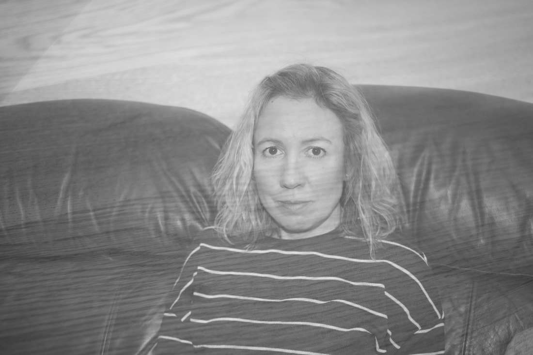
Shoot 1 - Wood
Here are some of my photographs:


My Edits:


|
This is my favourite piece from this shoot. The techniques used here are natural lighting, angle and height. The colours in the image are cold and mostly white/grey with a range of tone which gets darker towards the bottom of the picture. The patterns I can see in the image are created by the wood that looks like scratched across the photograph. The lines in the image draw your eye all over the picture and are caused by the wood. The texture in the picture looks harsh. |
|
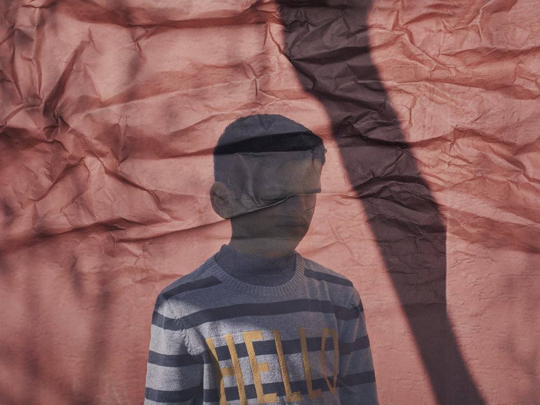
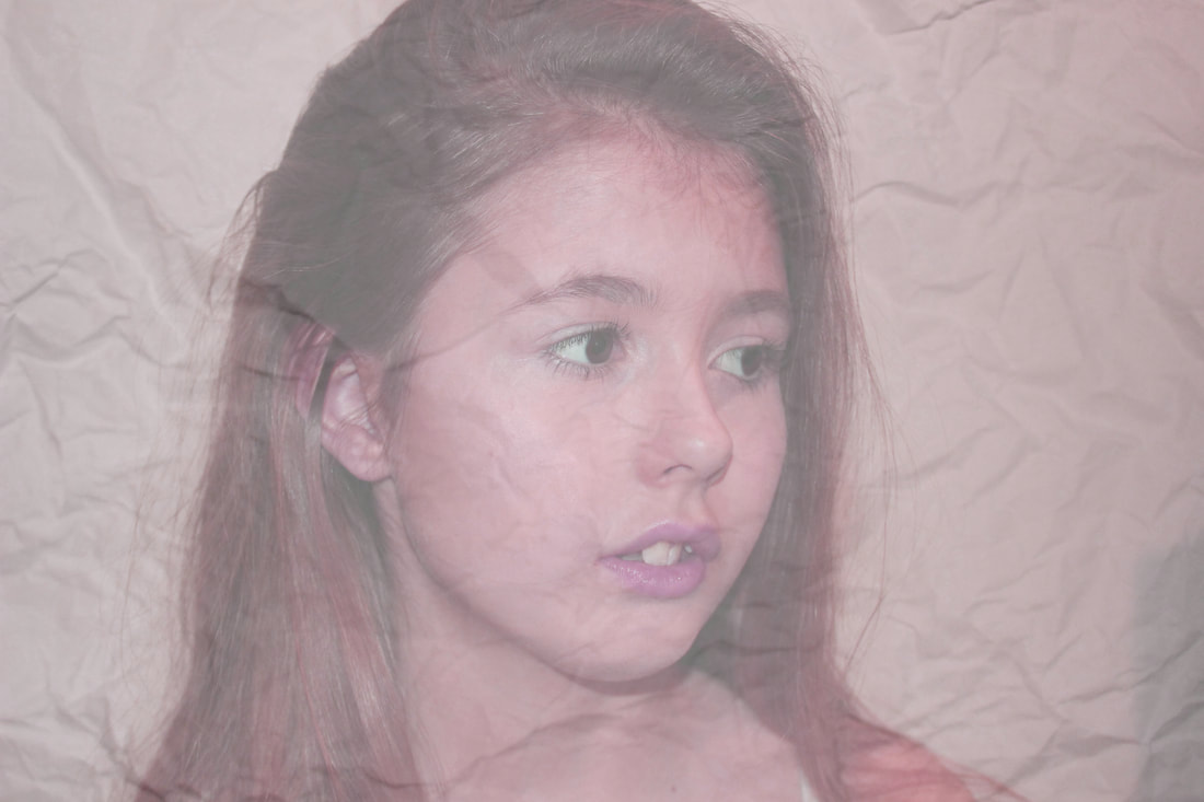
Shoot 2 - Scrunched Paper
Here are some of my photographs:


My Edits:


|
This is my favourite piece from this shoot and my final piece because I feel this shoot links the most to a photographer or one of my examples the best. This final piece looks similar to a few of Alma Haser's photography and work.
I really like the effect the scrunched paper has on the photograph, although it is not as distorted as the example by Alma Haser I still like the sense of texture the paper gives. I think it relates well to the example and the theme of materials. |
|
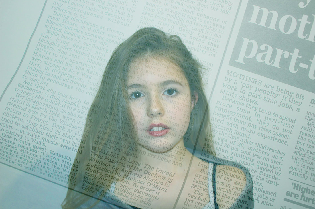
Shoot 3 - Newspaper
Here are some of my photographs:


My Edits:


|
This is my favourite piece from this shoot and my final piece because it links well to one of my examples and ties into the materials theme.
The focal point of the photograph (where your eye is drawn to) is the centre of the picture, as the newspaper overlay looks bland compared to the colour of the model. The colours in the image are relatively bright but also toned down, so the text in the newspaper is still clearly seen. The focal point (most important/eye-catching part) of the image is the model's face. The technique used here is natural lighting. The colours in the image are cold and mostly blue. The patterns I can see in the image are created by the print on the newspaper. The lines in the image draw your eye towards the top right hand corner and are caused by the darker shade of the picture in the newspaper. The texture in the picture looks smooth, as the newspaper that was used for layering was not crumpled. |
|
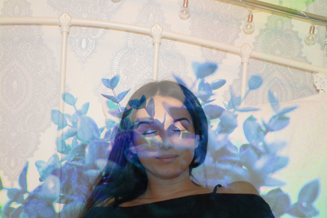
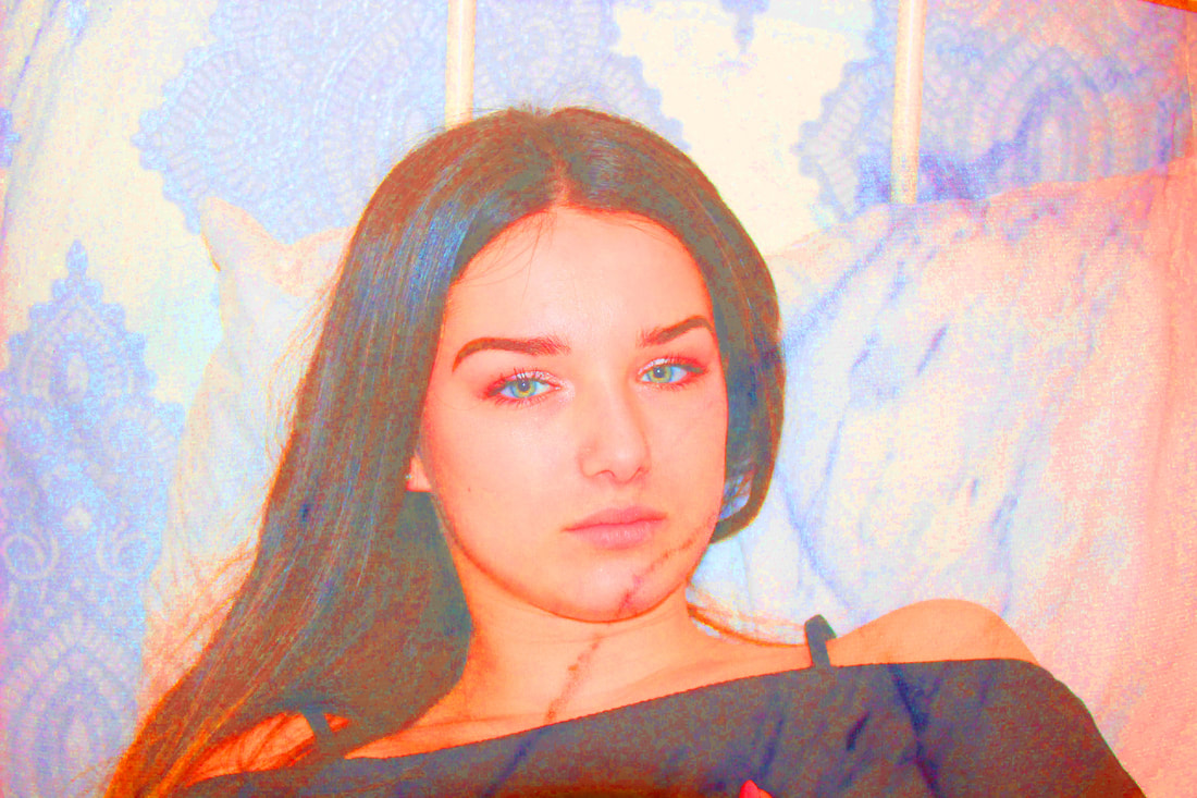
Shoot 4 - Plants
Here are some of my photographs:


My Edits:


My Final Piece:
|
This has been my favourite shoot so far, as I really liked the effect the plants had on the model and the photographs after editing.
I think I would like to improve on this idea and maybe use a really contrasted black and white effect, to outline the plant and make it the focal point. I might also use the effect that I had on one of my edits, with the black and white model and background, and the coloured plant in the foreground. The focal point (most important/eye-catching part) of the image is just below the models face, where her chin and the plant clash the most. The techniques used here are natural lighting and a direct angle. The colours in the image are cold and mostly blue. The lines in the image draw your eye to the models face, as that is the point in which the plant dips down. The texture in the picture looks smooth, and is created by the leaves of the plant. |
|
Shoot 5: Marble
My Photographs:


My Edits:


My Final Piece:
|
This is one of my favourite photographs from the shoot so far as I really like the pop art colours the editing gave the picture.
However, the marble effect is my least favourite of the shoots as it doesn't give it a very textured look. The focal point (most important/eye-catching part) of the image is the face of the model ,as that is the part of the photograph that holds the most colour. The techniques used here are the warm, natural lighting and a warm white balance. The colours in the image are warm and mostly yellow with a range of tone which is darker at the bottom of the picture. The patterns and lines I can see in the image are created by the marble material that is layered over the top of the photograph. The texture in the picture looks soft as the lines created by the marble layering are not harsh or obvious. |
|
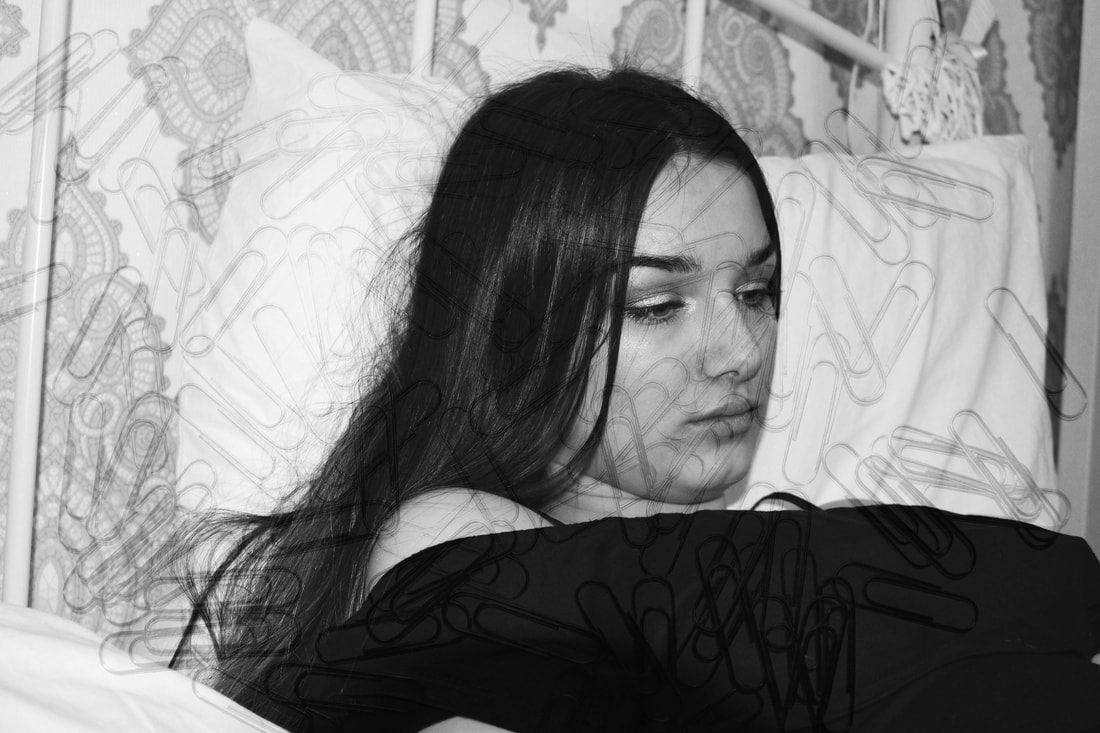
Shoot 6: Paper Clips
My Photographs:


My Edits:


My Final Piece:
|
This was not my favourite shoot as the paper clips did not give the photograph the textured feel I was aiming for.
It gives a slight look of distortion to the face but does not change the look of the face. The focal point (most important/eye-catching part) of the image is the model's face, as it covers the largest part of the photograph. The techniques used here are natural lighting. The colours in the image are cold and greyscale. The patterns I can see in the image are those made by the paper clips that cover the majority of the photograph. The only lines in the image are those made by the paper clips. The texture in the picture looks harsh, as made by the harsh and obvious lines of the paper clips. |
|
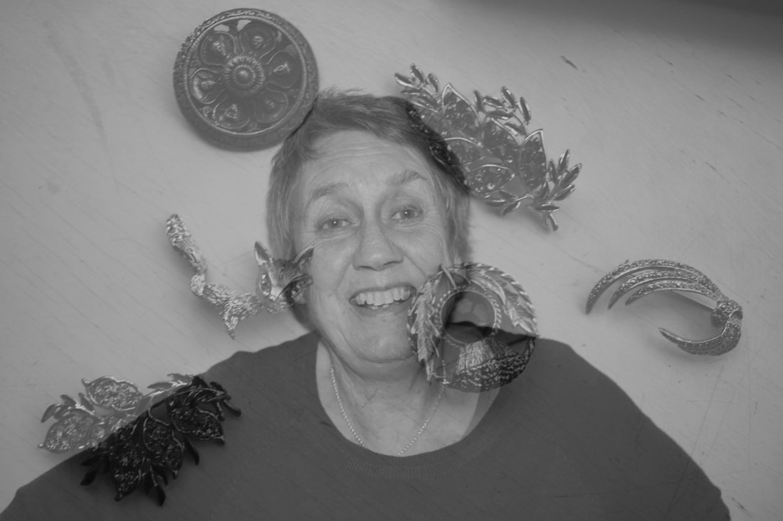
Shoot 7: Family
My Photographs:


My Edits:


Final Piece:
|
This is my final piece for this shoot because I like how personal and how much history there is. The focal point (most important/eye-catching part) of the image is the face of the model, and a few of the brooches. They are placed and scattered across the photograph. The techniques used here are natural lighting, angle and height and a cold white balance. The colours in the image are cold and mostly grey. The patterns I can see in the image are vague and irregular patterns on the brooches. The lines in the image draw your eye towards the centre and are caused by the lines of the model's shoulders. The texture in the picture looks soft on the model's clothing, but harsh on the wood of the surface.
|
|
